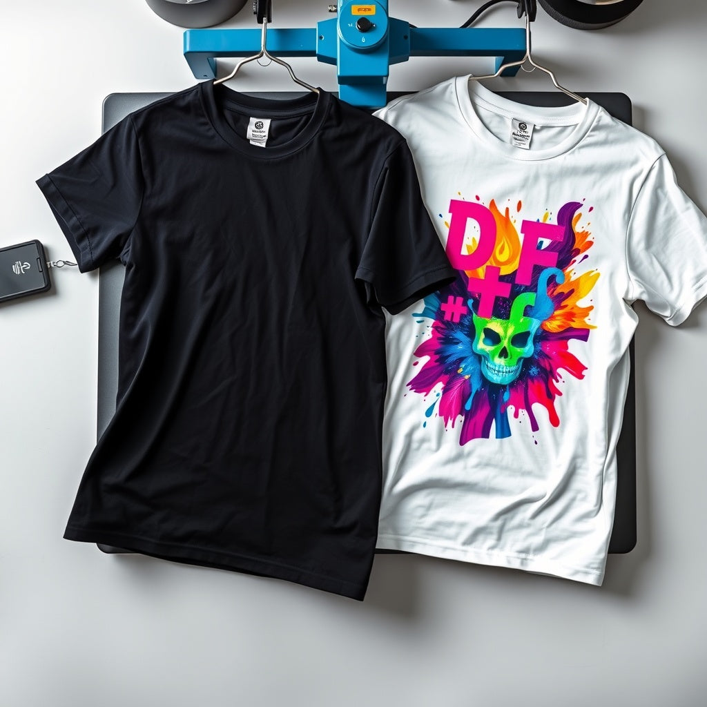
DTF Printing on Dark vs Light Fabrics: Key Differences
Quick answer: The DTF system described in this InkMerge guide can work on both dark and light garments. A white underbase sits behind the color artwork, helping the printed design remain visible across different garment colors. The same design may still look different on a black shirt than on a white one, and application settings should come from the exact transfer and garment—not from one universal recipe.
Why DTF can work on dark and light garments
The core reason is the white underbase. Color inks are supported by an opaque white layer rather than relying on the garment itself to provide a light background.
- Dark garments: the white layer separates the design colors from the dark fabric underneath.
- Light garments: the same underbase can still support the printed colors, although white or very pale design elements can visually blend into a light shirt.
That means you generally do not need a completely different artwork concept simply because the garment changes from dark to light, but you should still preview contrast and design details on the actual garment color.
What changes visually on dark garments?
Dark fabric creates stronger contrast around light artwork and around the edges of a transfer. White elements are easy to see, and the white underbase prevents the garment color from overpowering the printed design.
Because the contrast is stronger, edges or pale halos that are barely noticeable on a light garment can be easier to see on black, navy, or other dark colors.
What changes visually on light garments?
On white, cream, and other pale garments, the edge of the white underbase can visually blend into the shirt. At the same time, very light artwork—especially white design elements—can lose contrast against the garment.
If an important white element needs to remain visible on a white shirt, the artwork may need a contrasting outline or another intentional design treatment.
Do dark and light garments use the same heat settings?
Do not choose settings based only on garment color. The original article contained generic temperature ranges, but a safer rule is to follow the instructions supplied with the exact transfer and confirm that the garment can tolerate the process.
Fabric construction, coatings, dyes, transfer film, adhesive, pressure, equipment calibration, and peel method can affect the correct application process. Test one sample before pressing a full production run.
Fabric type matters more than color alone
A dark cotton shirt and a dark polyester shirt are both dark, but they can react very differently to heat. Polyester and other synthetic fabrics can present dye-migration or scorching concerns. The correct response is not to rely on a generic temperature from another article; check the garment and transfer instructions and run a sample test.
Watch for dye migration
Dye migration can occur when garment dye moves under heat and affects the appearance of the transfer. It is especially important to test dyed synthetic garments before a full run.
If you see unexpected color shifting, haze, scorching, or surface changes, stop and review the garment composition, transfer instructions, equipment calibration, and sample result before continuing.
Designing one artwork for several garment colors
Use strong contrast
Preview the artwork on both the darkest and lightest garment colors you plan to offer. A design that relies heavily on white may need a different treatment on a white shirt, while dark elements can disappear into black fabric if the artwork does not include enough contrast.
Be careful with semi-transparent effects
Transparency can change the visual relationship between the artwork and garment color. Test gradients, soft shadows, and partially transparent effects instead of assuming they will look identical on every shirt color.
Consider separate light- and dark-garment artwork when needed
One file can work across many garment colors, but a design that depends on a white border, black outline, or garment-colored negative space may look better with separate versions for light and dark shirts.
Does garment color change durability?
Garment color by itself is not a reliable durability predictor. Durability depends on the transfer, garment, application, and care process. Follow the care instructions supplied with the order rather than relying on a universal wash-count claim.
Dark vs. light garment checklist
- Confirm the garment is compatible with the transfer process.
- Preview artwork contrast on the actual garment color.
- Check white and very pale artwork on light garments.
- Inspect transfer-edge visibility on dark garments.
- Use the exact transfer-specific application instructions.
- Test dyed synthetic garments for color migration or heat damage.
- Press one sample before committing a full run.
Frequently asked questions
Do I need different DTF transfers for dark and light shirts?
Not solely because of garment color. The same compatible transfer can be used across dark and light garments, but artwork contrast and garment behavior should still be checked.
Why does DTF show on a black shirt?
The white underbase provides an opaque foundation behind the printed colors so the dark garment does not simply show through the artwork.
Will white artwork show clearly on a white shirt?
It can be subtle because the design and garment are both light. A contrasting outline or another artwork treatment can help when that white element needs to remain obvious.
Should I use a special temperature for dark polyester?
Use the instructions supplied with the exact transfer and confirm the garment’s heat tolerance. Do not rely on garment color alone to select a temperature.
Read current DTF application guidance · Learn about the white underbase · Browse DTF transfers
InkMerge Pro
Need the transfer, not the shirt?
Browse ready-to-press DTF designs or upload your own artwork. Current product pricing and shipping details are shown on the product page and at checkout.